Cinematic Color Grade
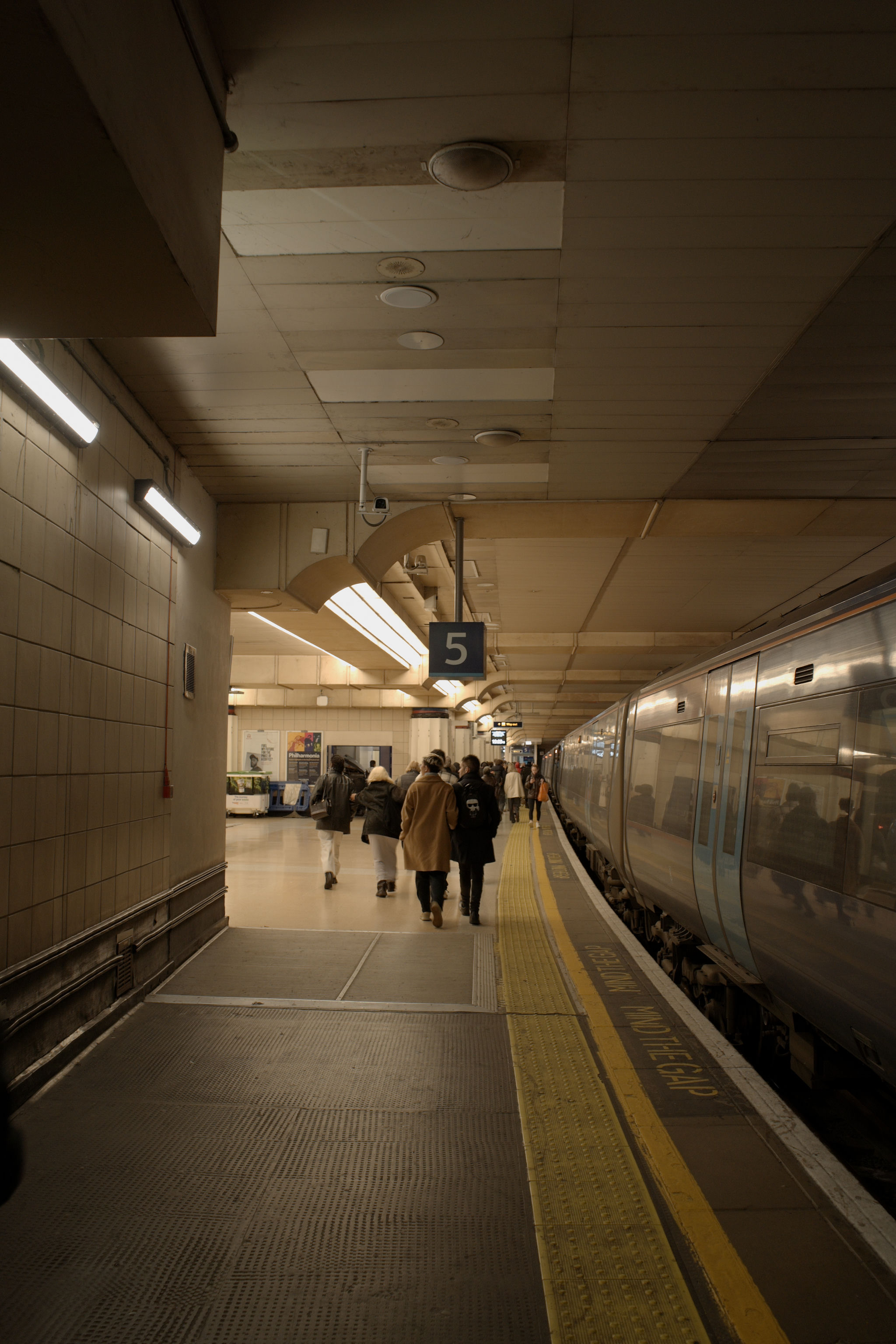
This tutorial walks through a complete teal-and-orange cinema grade applied to an outdoor scene. The technique generalizes to any palette; just change the wheel angles.
What we're trying to do
Push the shadows toward teal and the highlights toward orange. This is one of the most recognizable looks in modern cinema, used precisely because human skin sits in the orange range and contrasts sharply against teal.
Color grading is a finishing step, not a fix. Make sure the photo is already well-exposed and white-balanced before opening the wheels.
1. Establish the baseline
Open Adjustments (D).
| Slider | Set to | Why |
|---|---|---|
| Exposure | adjust to taste | Get midtones right first. |
| Highlights | as needed | Recover any clipping. |
| Shadows | as needed | Open shadows just enough to read. |
| Temperature / Tint | neutral your image | Don't fight the camera with a strong cast before grading. |
2. Open the Color Grading wheels
In the Color section, scroll to Color Grading. The 3-Way tab is selected by default; you'll see three wheels (Shadows, Midtones, Highlights) plus two sliders below (Blending, Balance).
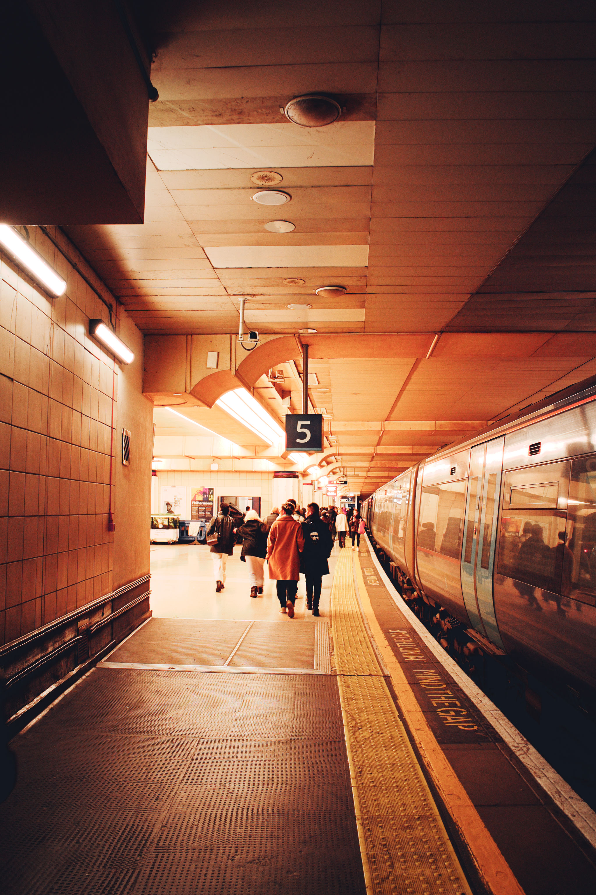
3. Push shadows toward teal
Drag inside the Shadows wheel toward the lower-left, around 200° (teal). Push the wheel marker about 30 to 50% out from center for moderate saturation.
Watch the dark areas of the photo take on a cool cast.
4. Push midtones toward orange
In the Midtones wheel, drag toward the upper-right, around 30° (orange). Match the saturation level you used in shadows.
Watch the bright areas, including any skin and sun-lit surfaces, pick up warmth.
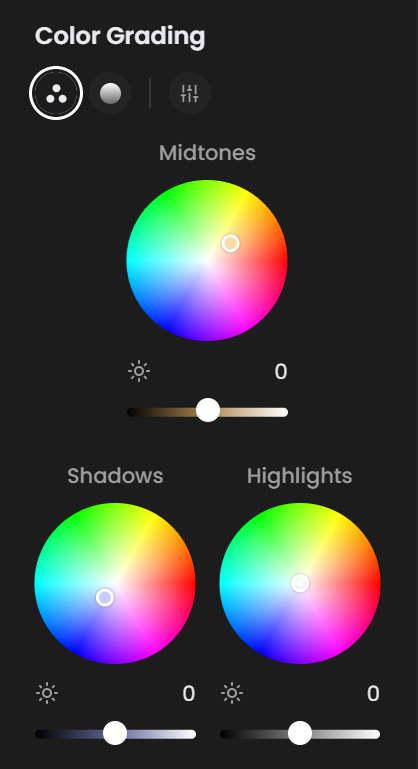
5. Tune Blending and Balance
| Slider | Set to | Why |
|---|---|---|
| Blending | 60 to 70 | Smoother transitions between zones. Lower for harder, more stylized cuts. |
| Balance | 0 | Keeps shadow / highlight emphasis equal. Push negative for shadow-dominant images, positive for highlight-dominant. |
6. Finishing touches
A few small adjustments seal the look.
| Slider | Set to | Why |
|---|---|---|
| Contrast | +40 | Adds bite. |
| Vibrance | −10 | Tones down the now-extra saturation from the grade. |
| Effects → Halation | 8 | Subtle warm bloom on highlights, very film-like. |
| Effects → Glow | 10 | Adds atmosphere without being obvious. |
Other looks built the same way
Same workflow, different wheel angles:
| Look | Shadows | Midtones | Highlights |
|---|---|---|---|
| Teal & Orange | Teal (~200°), sat 30 to 50% | Orange (~30°), sat 30 to 50% | Neutral or slight orange |
| Bleach Bypass | Slight cyan, sat 15% | Slight yellow-green, sat 15% | Neutral; lower global Saturation |
| Warm Filmic | Brown (~30°), sat 20% | Warm yellow (~50°), sat 30% | Neutral |
| Cold Cinema | Strong blue (~210°), sat 50% | Slight cyan (~190°), sat 20% | Neutral |
| Vintage Magenta | Magenta (~330°), sat 30% | Yellow (~60°), sat 20% | Slight magenta |
7. Save it as a Style preset
Once you're happy:
- Open Presets (
P). - + New Preset → name it ("Teal & Orange") → choose Style preset mode.
- Apply to other photos in this shoot or future shoots with one click.
You can also share the preset with the Community Presets by opening an issue on GitHub.
See also
- Color → Color Grading for the slider reference.
- Workflow: Color Grade with Wheels for the underlying technique.
- Curves for an alternative grading approach via per-channel R/G/B curves.